Poster project

size:
600*480
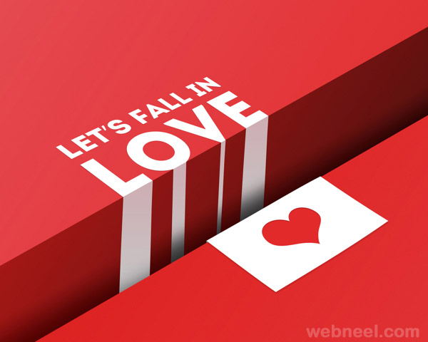
It’s really a talent
visual design which refers to the topic about “let’s fall in love” and designer
implements ideas of white space, grid, axes and alignment into this poster to
make the topic more dominant and powerful.
As you can see, the forefront of this poster are
characters and shapes in bright white color, everything else is the background
or white space. The designer splits the whole space into three pieces and fills
these pieces with three diverse red color: light red, gradual dark red and
bright red. The gradual dark red area seems like a deep gap between side cliffs
which filled with light red and bright red. There are also four dark white
shapes as the extension of “love” in gradual red area, seems like a waterfall
flows into the deep gap. Well, love falls into the gap like a waterfall and can’t
back to bank anymore, it highlights the topic of this poster extremely. And we
can speculate that the heart in opposite bank also falls into the gap like
letter “love”. It’s the hidden meaning we can understand from the flexible applying
of white space. As well, readers won’t feel boring and tired when they perceive
this poster because there is enough white space for them to rest eyes and
divert attention.
Here, nobody can
ignore white space in this poster because it’s the spirit of whole design.
In addition, we can
recognize that the most element of this poster occupied four intersections
points if we divide this poster into 9 sections vertically and horizontally, it
helps keep readers’ view on the letters and shapes consistently for a long
time.
The designer organizes
letters and shapes in diagonal line from upper left to bottom right, it impacts
readers’ visual hierarchy imperceptibly that readers may perceive this poster
from the diagonal line also. What’s more, this diagonal line alignment make
poster looks more aesthetical than random alignment.


size:
660*456
If there is no info letters
and icon symbol on the bottom, we can also easily understand the topic of this
poster is protecting elephant.
As you can see, it’s
a typical symmetrical poster. The combination of heart shape enclosed by human’s
hands and two black points makes up a concise head image of a cute elephant. Symmetrical
objects arrangement here makes this poster easier for readers to recognize and
speculate the deeper meaning, it also makes this poster an aesthetical design
for animal protecting purpose.

size:
560*770
In this poster, a gentle man is standing in front of a wall with
a phone holding in night. Wait, where is the wall? There isn’t a real wall that
can be obviously found in this poster. So how can I know there is a wall behind
the man?
Well, the answer is in white space. His shadow
was divided into two parts and there is an obtuse angle between them, it only
happens when there is a wall behind this man.
Perceive seriously, you’ll
find that the shape of man’s shadow is a dressed woman with a loudspeaker and
he looks perfectly relaxed from his smile and standing pose. So I speculate
that his wife is calling him urgently why he didn’t come home but he doesn’t
care about it.
The designer conveys
this hidden information by asymmetrically arranging the man and his shadow in
opposite positions on purpose, and I can also make sense about it when I realized
this asymmetrical arrangement. In addition, the size of the man and his shadow
are also asymmetrical.
Well, this poster is
a typical applying of asymmetry with an intentionally unbalanced layout.
No comments:
Post a Comment